
Admin Console for
Innoveo Skye
Project type: Internal enterprise tool redesign
Industry: No-code / Insurtech
Duration: 8 months
Role: UX Designer & Researcher — led discovery and design work in close collaboration with product and engineering
The Challenge: Transforming a Developer-Centric Tool for Business Users
The Admin Console is a core part of our no-code platform that enables users to build web applications without writing code. Originally developed by engineers for internal use, it became increasingly relied upon by business users to configure technical aspects like search indexes and logs.
However, the interface was unintuitive, cluttered, and required deep technical understanding—often leading to support requests and frustration.
🎯 Redesign Goals
-
Make complex technical workflows easier to understand
-
Help users feel confident completing tasks on their own
-
Improve consistency and align the tool with the design system
-
Build reusable UI patterns that could scale across other internal tools
My Role: Strategy, Research, and Design Leadership
I drove the redesign effort from discovery through delivery:
-
Conducted user interviews and usability tests to surface core pain points.
-
Synthesized findings to define personas and user needs.
-
Led ideation and prototyping, translating technical complexity into usable flows.
-
Partnered with product managers, developers, and BAs to prioritize features and drive alignment.
-
Handled all wireframes, high-fidelity mockups, and design documentation for development handoff.
Research & Analysis: Clarifying the Experience for Diverse User Types
To design an experience that worked for all users, I began by identifying usage patterns across three user types:
-
Power users: Technically savvy, familiar with platform quirks.
-
Occasional users: Know enough to use the tool but often need help.
-
Business users: Minimal technical background, need step-by-step guidance.
Key Pain Points:
-
Users didn’t understand labels or terminology.
-
No feedback on actions created uncertainty.
-
Technical errors were easy to make and hard to debug.
-
Workflows felt fragmented, with multiple context switches.
Mapping user goals helped surface key problem areas and informed how we grouped functionality.
Design Strategy: Make Technical Tasks Intuitive
Terminology and Content Design
-
Replaced internal jargon with plain, contextual language.
-
Collaborated with business analysts to rewrite help content for clarity.
Navigation and Structure
-
Reorganized sections into task-based groupings for better discoverability.
-
Consolidated related features to minimize unnecessary navigation.
The navigation and task/functionality structure.
User Feedback and Validation
-
The original application had deeply fragmented workflows with little to no user feedback during critical tasks. Users often completed a sequence of actions without being certain anything worked as intended—especially when adding or modifying complex configurations.
-
To address this, I redesigned these flows to be more linear, transparent, and reinforced by real-time validation and status indicators. The new patterns ensured users understood:
-
What step they were on
-
What was required before proceeding
-
Whether an action had succeeded or failed
-
Visualizing Flow Improvements
To align the team and guide the redesign, I created annotated wire flows that mapped out the revised interaction logic for key tasks. These flows highlighted: -
Decision points
-
System states
-
Feedback messages
-
Error prevention measures
Redesigned task flow for adding a new configuration with built-in validation and feedback
Component Thinking
The Admin Console had grown organically, leading to UI inconsistencies and duplicated patterns. I conducted a component audit to identify redundancies and propose standardized solutions. This work fed into the broader design system and helped us:
-
Streamline repetitive UI elements like query criteria, status indicators, and editable tables.
-
Introduce new reusable modules such as a query builder, configuration summary cards, and confirmation patterns for destructive actions.
-
Lay the groundwork for more scalable and maintainable UI going forward.

Standard and specific UI elements are now handled as reusable components.
Iterate to Refine: Testing Concepts to Improve Outcomes
To validate design decisions and refine usability, I ran multiple moderated usability testing sessions with medium-fidelity prototypes. Insights from these sessions directly informed the following improvements:
1. Bringing Documentation Into the Platform
Research showed users often relied on external documentation or colleagues. To address this, we embedded expandable, contextual help areas throughout the UI.
-
💡Early idea: Always-visible help text at the top.
-
🔈User feedback: Too cluttered; users preferred on-demand access.
-
🎯 Final solution: Collapsible help sections that can host detailed explanations when needed, developed in collaboration with the BA team.

Collapsible help section for accommodating the most important usage guides.
2. Introducing Filters and Search Options
Tasks like setting log levels required users to scroll through long, unstructured lists. We observed varying search behaviors—some filtered by category, others searched by name.
🎯 Design response: Introduced dual filter and search capabilities to accommodate both mental models and speed up task completion.

Category filter and free text search for log configuration.
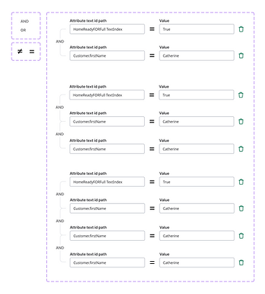
3. Improving Query Tools
The platform’s simplified query feature was powerful but poorly understood. Users were confused about how to write criteria and interpret relationships between them.
-
🎯 Solution: Designed a new “criteria builder” interface with clearer grouping, language, and affordances. Future versions will expand functionality with conditional logic.

4. Details Panel for Simpler Flow
Previously, editing a record would send users to a different view—losing their search context. This interruption caused frustration and slowed down multi-record workflows.
-
New approach: Introduced a collapsible side panel for viewing and editing details inline, keeping the main search table in view for continuity and faster interactions.

Outcomes: A More Usable, Support-Light Admin Console
While the full impact will be validated post-implementation, usability testing and stakeholder feedback indicate clear improvements:
-
Increased confidence: Users felt more independent and less reliant on external support.
-
Streamlined workflows: Tasks could be completed with fewer clicks and better clarity.
-
Scalable foundation: The design system components created here will be reused across future technical tools within the platform.
Reflections: From Complexity to Clarity
This project reaffirmed the power of user-centered design when applied to technical products. By simplifying workflows, embedding documentation, and designing flexible interfaces, we helped bridge the gap between business users and developer-built tools. The work also laid a foundation for more scalable, consistent design patterns across the platform.