Flexible Components Make Flexible Design Systems
📍5 min read, Jan 8, 2025
Balancing generality and specificity is often challenging when designing components for a design system. A component library should offer reusable elements and out-of-the-box solutions so designers can focus on user flows instead of rebuilding UI elements from scratch.
This guide explains how to identify areas where components should be flexible, where to include ready-made solutions, and how to implement these in Figma using the slot technique. I’ll use one of my recent contributions—the rich text editor component—as an example. This project aimed to unify the text editor experience across different areas of our product.
Discovery and Analysis: Identify Areas of Flexibility and Specificity
Requests for new components often come with highly specific requirements, but a design system must prioritize reusability. A thorough discovery can help find the balance between reusability and specificity.
Here’s a streamlined checklist to ensure you collect all necessary information while keeping the discovery process efficient:
-
Gather use cases from your broader UX team
-
Announce you are working on this new component and ask for existing use cases and solutions.
-
Collect designs, screenshots, and usability test results.
-
Consult developers about the underlying technology.
-
-
Research best practices and external references
-
Compare and refine
-
Identify common patterns and best practices.
-
Compare existing solutions to best practices.
-
Note and screenshot relevant behaviors (e.g., responsive adjustments).
-
💡Tip: Use AI tools to find relevant resources and highlight key insights. Be cautious not to share sensitive business information with public AI models.
Component Design Informed by Discovery
When designing the rich text editor, comparing existing use cases with best practices helped me determine which aspects needed to be flexible and which should be standardized.
The Editor's Toolbar
Text editors in our product serve various purposes—chats, emails, and content creation—each with unique requirements. However, common formatting actions emerged as a shared need. The toolbar became the first area to introduce flexibility.
Defaults: Pre-Selected Formatting Actions
Rather than creating a fully generic toolbar, I included the most frequently used formatting actions by default. These were chosen based on:
-
Common needs across different product areas.
-
Standard formatting actions found in external rich text editors.

Default toolbar functionalities based on common product needs and best practices.
This approach ensures designers and developers start with a functional base while allowing customization as needed.
Expanding the Toolbar’s Capabilities
To accommodate different text editor use cases, I’ve decided to make this area fully customizable by:
1. Adjustable button groups and actions: designers can modify the number of button groups and actions.


Adding a new button group by changing the number of button groups on the toolbar layer.

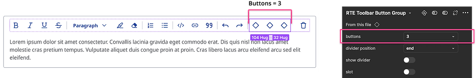
Increasing the number of buttons within a button group.
2. Slot-Based Customizations: Since Figma doesn’t support dynamic properties, I used slots to allow designers to add custom actions without detaching the component.

A slot-enabled button group, allowing custom actions.
By combining default options with customizable slots, the toolbar provides flexibility while maintaining efficiency.
The Content Area
The second area requiring flexibility was the content block section. Similar to the toolbar, I included common content block types while providing an option for customization.
Pre-Set & Expandable Content Blocks: Designers can select up to five content blocks.

The number of content blocks increased to 3.
Custom Content via Slots: For cases requiring more than five blocks or unique content, a slot enables infinite customization.
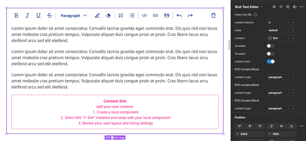
The content slot accommodates custom content or more than 5 content blocks.

The second content block type changed to code block.
Rich Text Editor Menu
During discovery, we found that many clients wanted to apply custom branding (typography, colors, images) within the editor. However, our general menu component had fixed styles, making it difficult to accommodate these needs.
To solve this, I created a dedicated menu sub-component that:
-
Inherits styles from the main menu component.
-
Uses a slot instead of predefined menu options, allowing designers to add custom text styles and colors.
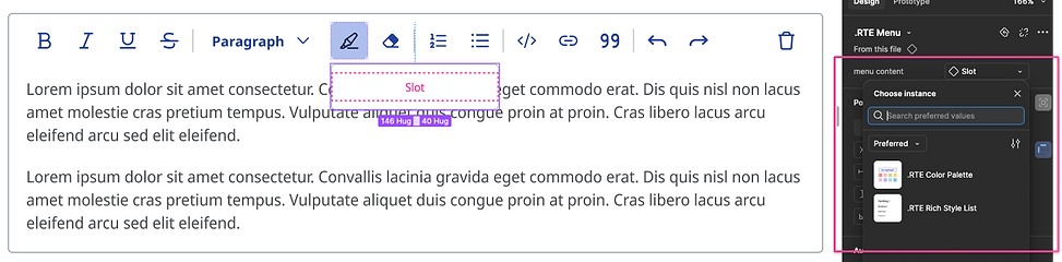
A rich text editor menu styled consistently with our main menu component, yet flexible for custom controls.

Custom controls slotted into the editor’s menu.
Specific, hidden components
Some elements—like the specialized rich text editor menu—were too tailored to be reused elsewhere in the design system.
-
These were kept hidden by prefixing their names with a ‘.’ in Figma.
-
This prevents unnecessary complexity while ensuring flexibility where needed.

Custom sub-components hidden from the library to avoid misuse.
Testing the component
Before publishing a new component, testing is crucial to ensure it supports real-world design workflows and is user-friendly. In this article, I explain how to test new components with designers and end users.
Recap and checklist
To create a flexible component:
✔️ Conduct thorough research on existing solutions and use cases.
✔️ Benchmark findings against best practices.
✔️ Provide usable defaults to streamline the design process.
✔️ Introduce adjustable properties for elements like button groups and content blocks.
✔️ Use slots to allow customization without detaching the component.
✔️ Test with designers in real design projects.
By following this process, you can design components that balance efficiency with flexibility—empowering designers to work faster while maintaining consistency.