
CASE STUDY
InstUI Design System
An ongoing project for defining foundations, patterns, and processes
for a cohesive product ecosystem
Intro
This case study focuses on how we rebuilt the foundations of an existing design system to support
flexible theming, accessibility, and safer adoption across multiple products.
The work spans technical infrastructure, visual foundations, and cross-functional processes, with an emphasis on pragmatic decisions and trade-offs required in an enterprise edtech environment.
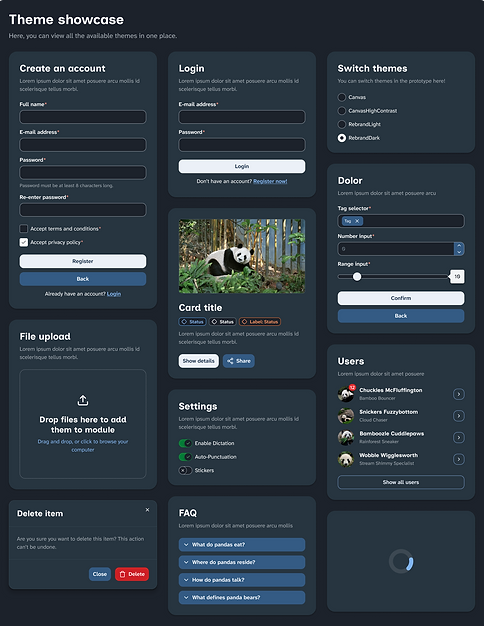
Foundations — Design Tokens & Theming
Moving from Manual Tokens to a Shared Source of Truth
In the previous setup, Figma variables and CSS variables were managed separately. Designers defined variables in Figma, passed them to developers, and developers recreated them manually in code.
This duplicated effort, slowed everyone down, and introduced unnecessary inconsistencies.
To eliminate this, I introduced Tokens Studio. Tokens are defined by designers in JSON, exported to Figma variables, and pushed directly to Git. From there, developers can transform the same token source to fit the codebase. This removed redundant work and made design tokens a shared responsibility instead of a handoff.
Defining the Token Architecture
I worked closely with developers to define a token structure that would be flexible enough for future theming while remaining safe for existing products.
The base structure consists of primitive → semantic → component layers.
-
Primitives define raw values (colors, spacing, typography)
-
Semantics describe intent (e.g. surface, text, border)
-
Component tokens map semantics to actual component

Theme switching is supported at both the semantic and component layers, which gives us maximum flexibility. While the system currently supports four themes, the theming engine allows us to add more later without introducing breaking changes.
Trade-offs, Constraints, and Change Management
When “Doing It Right” Would Have Broken Everything
Centralising token management initially made it seem possible to fully redesign both the component token layer and many existing components. While these changes would have improved clarity and consistency, they would also have introduced structural changes and breaking behaviour for product teams migrating to the new major version.
As developers explored the codebase and we spoke with product teams, it became clear that this approach carried too much risk—especially in an enterprise edtech context, where major updates can realistically happen only during summer breaks.
The Ideal System
Breaking change
-
Structural improvements for most components
-
Rebuilt component token layer
-
New theming engine with 4 themes
-
Cleaner long-term architecture
🛠️ Heavy manual migration needed
⏱️ Approx. 1.5 yrs delivery time
The Initial Release
Safe to adopt
-
Component structure kept intact
-
Only the semantic token layer is rebuilt
-
New theming engine with 4 themes
-
Essential a11y and usability improvements
🪶 No manual migration needed
⏱️ 6-7 months delivery time
We chose to keep the existing component tokens and component structures largely intact, and instead focus on strengthening the semantic token layer. This allowed teams to adopt the new theming engine and updated look and feel with minimal manual migration, while preserving a solid foundation for future, incremental improvements.
Foundations — Visual Language
Why a Visual Refresh Was Necessary
A visual refresh of Canvas (the core product) was long overdue. Beyond general aging, acquisitions had introduced multiple visual languages across the platform, and there was limited guidance for how new features should look and feel across different product areas.
As part of the project, we worked closely with other product teams who had already been exploring more modern visual directions. We incorporated their inputs, concepts, and an approved color palette into the design system work, using them as a starting point rather than a finished solution. This collaboration helped ground the new look and feel in real product needs instead of treating it as a purely centralized exercise.
One of the key challenges was finding a visual language that could scale across very different contexts.
Some stylistic choices that worked well on simpler screens became visually noisy or space-inefficient on denser interfaces. Given that the platform serves learners, teachers, and parents from primary education through higher education, the refreshed style needed enough flexibility, restraint, and longevity to work across a wide range of use cases.
Customization as a Design Constraint
Canvas allows institutions to customize parts of the UI via a theme editor. Through this project, we learned that some of these customisations affect critical UI elements, such as button backgrounds — often resulting in accessibility and usability issues.
Old Base UI Customized

❌
Critical UI elements
(e.g. navigation, CTAs) can be customized without constraints
❌
No limits on color, contrast,
or font size
❌
Leads to accessibility issues
and broken semantics
(e.g. neutral actions styled as “danger”)
❌
Potentially inconsistent experiences across products
Addressing customer theming behaviour itself was out of scope, but we designed the new foundations with this reality in mind. Our goal was to create a look and feel neutral enough to integrate into institutional ecosystems, reducing the urge for heavy customisation.
The timing worked in our favour: marketing introduced a deep navy as a core brand color, which we adopted as the primary color in the system, replacing the previously very prominent blue.
New Base UI

✅
Neutral, navy-based core palette reduces the need for heavy branding overrides
✅
Critical UI elements are visually stable and predictable
✅
Decorative elements (logos, imagery, illustrations) remain flexible
✅
Planned: accessible color palettes for safe, extended customization
Iterating the Visual Foundations
We explored redesigned versions of existing screens together with product teams, using their visual experiments as a starting point and testing how well different ideas held up across the platform. Directions that felt modern and playful in isolation needed to be adapted to work in denser, more complex interfaces.
Along the way, we made several foundational decisions:
-
Introduced Atkinson Hyperlegible for accessibility and readability
-
Agreed on navy as the primary brand color
-
Extended the color palette after discovering it lacked depth in both light and dark modes
-
Introduced a more minimalistic and elegant icon library (Lucide)
-
Refined color values during component work, adjusting brightness and balance even when contrast ratios technically passed

Instead of finalising foundations upfront, the primitive token layer evolved alongside real component usage, which helped surface issues early and avoid locking in decisions too soon.
Collaboration and Processes
Aligning Design, Development, and Accessibility
Given the tight timeline, fast feedback loops and clear collaboration were critical. I ran workshops with design, development, and accessibility to align on goals, responsibilities, and touchpoints.
To structure these conversations, I adapted a component lifecycle framework I had used in a previous role. Together, we tailored it to fit this project’s scope and pace.
We walked through each lifecycle phase, clarifying who is involved, what decisions are made, and what “done” looks like. This helped build empathy across disciplines and reduced friction later on.
📍 Key Decisions
-
Shared Slack channel for design, dev, and a11y
-
Fast feedback loops → channel has priority during this project
-
Consult early, continuously during design & build
-
Formal a11y sign-off
before release (after UX QA)

Internal Design Processes and Adjustments
Within the design team, we created clear guidelines for component creation and token contribution, including phase-specific checklists.
One challenge emerged quickly: Tokens Studio does not handle many simultaneous contributors well, and its learning curve was steep for designers without frontend experience. Initially, this slowed progress and affected motivation.
We adjusted by redistributing responsibilities:
-
Designers with token and frontend experience focused on token work
-
Designers with strong component experience focused on building components using provided tokens
This change significantly increased velocity and helped everyone work closer to their strengths.
Scope Control and Strategic Focus
To meet the deadline without introducing breaking changes, we deliberately limited scope: no major structural component redesigns and minimal changes to component tokens.
This trade-off enabled something valuable. Through conversations with product teams, we learned that while a new component library was important, certain core patterns were even more urgently needed. We prioritised patterns such as filtering, sorting, and bulk actions — areas repeatedly identified as pain points and “lifesavers” for teams.
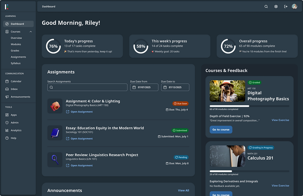
Current Status and What's Next
Where We Are Now
-
~85% of the new component library completed, with theming fully integrated
-
The theming engine supports four themes
-
Critical patterns (search & filter, bulk actions, AI presence) nearing completion
-
Product teams actively testing and migrating high-usage components
-
Early feedback already influencing refinements and bug fixes
-
Foundations laid for a more collaborative and inclusive design system community
.png)
.png)
After the Major Release
Following the MVP release, the focus shifts to:
-
Structural component improvements via dot releases
-
Adding a high-contrast theme for the new look and feel
-
A full redesign of the documentation site
-
Education, adoption, and support to enable a more federated model
-
Tracking adoption metrics across defined phases